Starting with a Neutral Color Palette
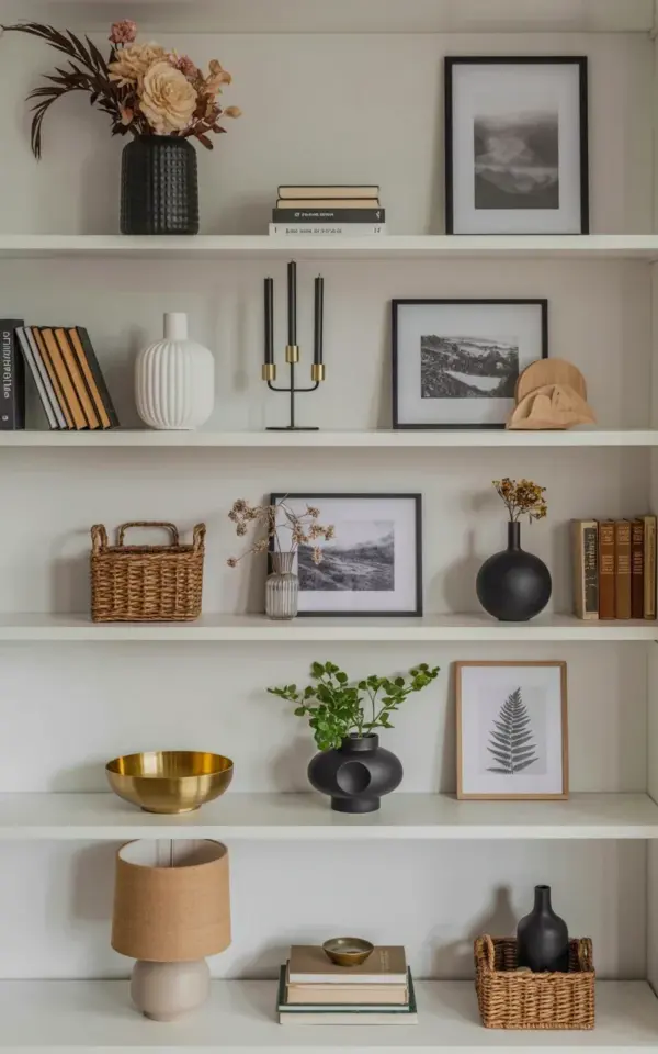
So you want to nail minimalist bookshelf styling in your bedroom. Honestly, I get it. There’s something so calming about a shelf that doesn’t scream for attention. The easiest way to start? Stick to a neutral palette. Black, white, beige, maybe a whisper of light gray. That’s it. Look at the photo we’re working with. Five white shelves against a light gray wall. No bright reds or electric blues anywhere. That’s deliberate. Neutral colors let your eye rest. They don’t compete with your brain when you’re trying to unwind at night. And here’s a real beginner truth: you can pick up most of these items at a thrift store or a big box shop for under twenty bucks. No fancy local artisan needed.
Think of neutrals as the quiet foundation. Once you have that, every single object you place on the shelf becomes a small moment of visual peace. Weirdly specific personal aside: I once tried to style a shelf with bright yellow ceramic mushrooms and a neon sign. Looked like a carnival exploded. My bedroom felt like a headache. So learn from my mistake. Neutral first. Always.
Bringing in Natural Textures (Without Clutter)
A neutral palette can feel cold if you don’t add texture. That’s where natural materials come in. Dried flowers, woven baskets, raw clay vases. In the photo, the top shelf has a black textured vase holding dried beige and pink flowers. Notice the texture of the vase. It isn’t smooth and shiny. It’s matte, almost rough. That little detail adds warmth. The third shelf includes a woven basket. That’s another hit of natural fiber. You want these things because they break up the flatness of paint and wood.
Ok so here’s a quick checklist for your next shopping trip:
Natural texture ideas for shelf decor:
- A small woven basket (tiny, maybe four inches tall)
- Dried eucalyptus or a bundle of preserved lavender
- A ceramic vase with a visible grain or hand-painted irregularity
- A piece of raw driftwood or a smooth river stone
Don’t overdo it. Three textures across all shelves is the sweet spot. More than that and you’re back to chaos.
The Odd Number Rule (Yes, It Actually Works)
Ever notice how groups of three or five just look better? Not gonna lie, I didn’t believe it either until I tested it. On the top shelf in the image, you’ve got three items stacked in a row: the vase, the stacked black books, the framed black and white artwork. That’s three. On the second shelf there’s a white ceramic vase, a black candlestick holder with black candles, and framed landscape photos. That’s also three. Coincidence? Not even a little. Odd numbers create a natural focal point. The eye doesn’t try to split the group into pairs. It just wanders happily over the arrangement.
A couple of practical wrinkles: If you have five items, group them loosely. Don’t line them up like soldiers. Let some lean, let others sit forward. Odd numbers work better when they’re staggered. Also, avoid groups of one unless that one object is large and bold. A single small item looks lonely. Two items look like a couple arguing. Three feels like a conversation.
Varying Heights for Visual Balance
Height variation is the secret sauce. Seriously. Look at the photo again. The top shelf: tall vase (maybe twelve inches high), medium stack of books (six inches), then a framed picture that’s also medium height. But the candlestick on the second shelf is much taller than the white vase next to it. The woven basket on the third shelf is squat, while the dried flowers in the black vase shoot up. That alternating height makes your brain happy. Flat rows are boring. Flat rows look like a store display.
Here’s an easy formula I use: For every shelf, include at least one tall thing (over ten inches), one medium thing (five to eight inches), and one short thing (under four inches). You can repeat that pattern across shelves. But mix up the order. Don’t put tall on the left every time. The photo has tall in the center on the top shelf, but tall on the right on the second shelf. Keeps it fresh.
Artwork and Frames: Keep It Simple and Personal
Now let’s talk about the framed pieces in the image. The top shelf holds a black and white framed artwork. The second shelf has framed black and white landscape photographs. That’s intentional. Not colorful prints of sunsets or huge typography posters. Black and white fits the neutral vibe. And they’re small – a standard 5×7 or 8×10 frame. For a bedroom bookshelf, oversized frames dominate too much. You want artwork that whispers, not shouts.
One pro tip: Use the same frame color across all pieces. The photo uses black frames. That creates a subtle repetition that ties everything together. Mixing gold and silver and wood can work, but it’s harder for a beginner. Stick to one finish for the first attempt. You can always swap later when you’re more comfortable. And honestly, you don’t need expensive art. A simple pencil sketch, a black and white photo you took, even a page torn from a vintage book. Personal is better than expensive. No one is judging your shelf for being budget-friendly.
Stacking and Grouping Books Like a Pro
Books can be tricky because they come in different sizes and colors. In the photo, the top shelf has stacked black books – they’re all the same dark color. The third shelf has vintage style brown books standing upright. Notice that the black books are stacked horizontally (flat), while the brown ones are vertical. That’s a choice. Mixing orientations adds variety. Don’t line up all books like a library. Stack some flat, lean a few against others, maybe slip a small object between them.
If you have mismatched book spines, you can hide them. Turn a few books around so the pages face outward. That gives you a neutral cream or off-white color. Am I saying you should hide your favorite neon-pink romance novel? Yes. Absolutely. Your bookshelf is a mood, not a bibliography. You can pull out the colorful ones when you’re actually reading them. For daily decor, keep spines muted.
Finishing Touches: Dried Flowers, Candles, and Baskets
The last layer is the small stuff. Dried flowers in a black vase. A black candlestick holder with black candles. A woven basket on the third shelf. These are the objects that make the shelf feel lived in without feeling messy. A quick note about candles: If they’re real, make sure they’re not near anything flammable. The photo shows black candles in a holder – that’s safe because they’re contained. But honestly, I use LED candles inside my decorative holders. No wax drips, no fire risk, and I can forget they exist for six months.
Dried flowers are perfect because they last forever. No watering, no wilting. The beige and pink ones in the photo add a hint of soft color without breaking the neutral rule. You can find dried bunches at craft stores or even online for a few dollars. One bundle per shelf is plenty. Tuck a small basket in a corner of a shelf. It can hold nothing at all. It’s just there for texture. That’s the whole point. The basket isn’t useful. It’s visual. And that’s okay – not everything on your shelf needs to serve a function. Some things are allowed to just look nice.
So give it a shot this weekend. Pull out a few items from around your house, stick to black, white, and beige, and add one natural texture per shelf. Group in odd numbers, vary the heights, and don’t overthink it. Your bedroom will feel calmer before you even finish arranging the third shelf. And that’s the whole reason we’re here, right?
#minimalistbookshelf #bedroomdecor #bookshelfstyling #neutralhomedecor #shelfdecor
Leave a Comment